1. Artiveko Studio
  2. »
  3. Blog
  4. »
  5. The Truth About Typography and Conversions in 2025

The Truth About Typography and Conversions in 2025

September 4, 2025
Share :

Your design looks stunning.
But… no one clicks. No one buys. What went wrong?

Maybe the problem isn’t your layout, copy, or even product.
Maybe it’s your typography.

Yes—fonts affect conversion. In fact, they might be one of the most underrated factors in digital design that can make or break your results.

Let’s break down exactly how typography influences conversion, and how to use it right in 2025.

The Truth About Typography and Conversions in 2025

💥 1. Typography Controls Visual Flow

Great design leads the eye.
Typography decides where the eye lands first, second, and next.

  • A bold headline font grabs attention
  • Clear subheadings guide scanning
  • Well-spaced body text keeps users reading longer

When users understand your message quickly, they convert faster.

🎯 Use font hierarchy to lead readers to your CTA.

🧠 2. Fonts Affect Trust (Which Affects Conversion)

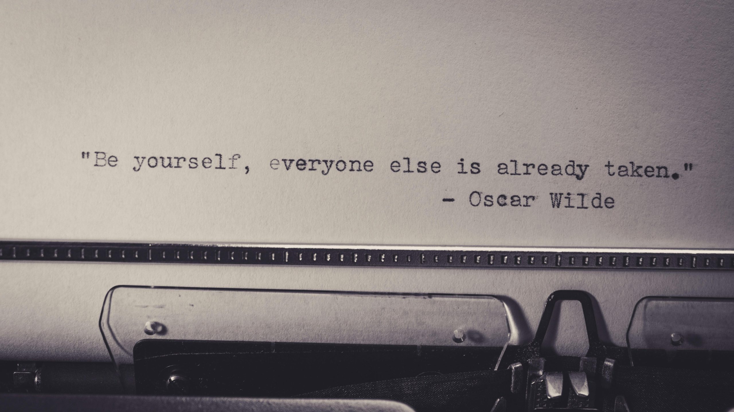
We’ve said it before: people buy from brands they trust.
And trust is visual first.

  • Generic fonts = generic brand = low confidence
  • Clean, intentional typography = high-quality impression

Studies show users form brand impressions in 50 milliseconds.
Fonts are the brand in those 50ms.

🖼️ 3. Readability Impacts Action

If they can’t read it, they won’t click it.

Here’s what kills readability (and conversion):

  • Fonts that are too small or too thin
  • Poor contrast with background
  • Tight line spacing
  • Fancy script fonts in long paragraphs

In contrast, clean, readable typography = higher chance people understand and act.

📱 4. Mobile Typography Makes or Breaks Your Funnel

More than 60% of online actions happen on mobile.
If your typography looks great on desktop but messy on mobile, it’s game over.

Tips:

  • Use responsive fonts or variable fonts
  • Test on multiple screen sizes
  • Avoid center-aligned body text on small screens

📊 5. Font Choice Influences Emotional Reaction

Different fonts trigger different vibes:

  • Bold sans-serif → urgency & confidence
  • Serif fonts → luxury & tradition
  • Monospace → tech & precision
  • Handwritten → personal & warm

Match your font mood to the action you want users to take.

🧠 Psychology = conversion booster.

💸 Quick Wins to Boost Conversion Using Typography

  1. Use font hierarchy: headline → subhead → CTA
  2. Make sure all fonts are fully legible
  3. Avoid using more than 2–3 font families
  4. Use whitespace to give breathing room
  5. Align font style with your audience (fun vs. serious, premium vs. playful)

🛍️ Ready-to-Convert Fonts at Artiveko

Need fonts that look amazing and convert?
At Artiveko, we design typography that blends beauty and performance:

  • Commercial-ready licenses
  • High readability
  • Modern, trust-building styles

👉 See Conversion-Friendly Fonts

🔗 External Link:

Read Essentials Google Font

Related Post

Leave a Reply

Your email address will not be published. Required fields are marked *
Scroll to top