1. Artiveko Studio
  2. »
  3. Blog
  4. »
  5. Typography Mistakes That Make Your Brand Look Unprofessional

Typography Mistakes That Make Your Brand Look Unprofessional

September 7, 2025
Share :

Typography is powerful.
It can make your brand look sleek and premium—or cheap and amateur.

Sadly, many businesses fall into the same design traps.
Let’s break down the 5 most common typography mistakes that hurt your branding, and how to avoid them starting today.

5 Typography Mistakes That Make Your Brand Look Unprofessional

❌ 1. Using Too Many Fonts

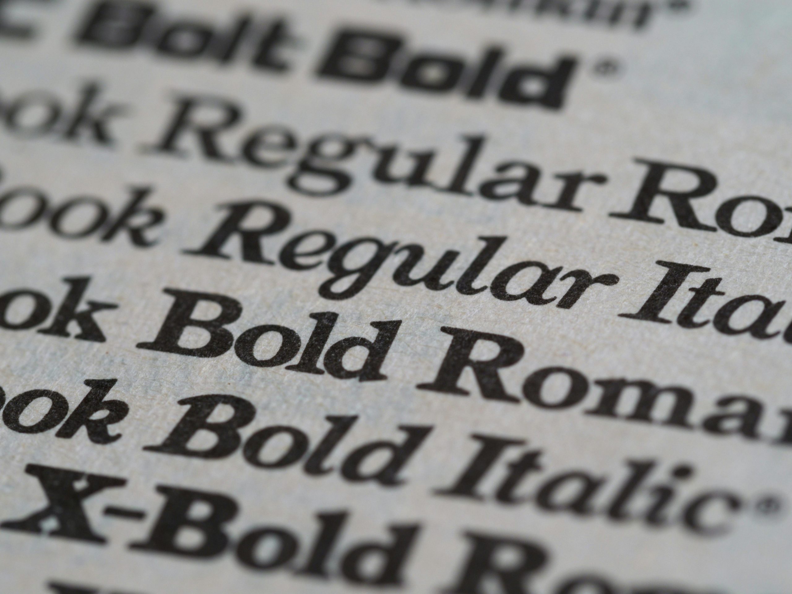
Mixing 4–5 different fonts in one design? It screams messy and inconsistent.

Fix it: Stick to a clean 2-font combo:

  • 1 for headings
  • 1 for body/captions
    (+ optional accent if needed)

🎯 Need pairings? Check our font duos →

❌ 2. Poor Readability

Tiny text. Thin strokes. Bad contrast.
If people have to squint to read your content—they won’t.

Fix it:

  • Use at least 16px for body text
  • Avoid super thin fonts for paragraphs
  • Check your color contrast (dark-on-light is safest)

❌ 3. Inconsistent Styles Across Platforms

One font on your website. Another on your packaging. A third on Instagram.
Result? Your brand looks confused.

Fix it:
Create a font style guide and apply it everywhere:

  • Website
  • Social media
  • Ads
  • Invoices, even!

👉 Learn how to make one →

❌ 4. Overused Generic Fonts

Everyone uses Roboto. Or Arial. Or Lobster 🙃
If your goal is to stand out, don’t look like everyone else.

Fix it:

  • Invest in premium fonts
  • Use custom fonts that reflect your tone & identity
  • Try fonts with character, not clichés

🎯 Start here: Explore our font library

❌ 5. Ignoring Font Hierarchy

When every word looks the same, nothing stands out.
Your audience doesn’t know where to look first.

Fix it:

  • Use size & weight to show importance
  • Headline → Subhead → Body
  • Add spacing for clarity

🧠 Bonus tip: Use white space like a design pro.

🛍️ Make Your Typography Work for You

Typography isn’t just decoration—it’s brand communication.

At Artiveko, our fonts are built to:

  • Elevate your brand look
  • Improve readability
  • Stay consistent across all touchpoints

👉 Find your perfect font

Related Post

Leave a Reply

Your email address will not be published. Required fields are marked *
Scroll to top