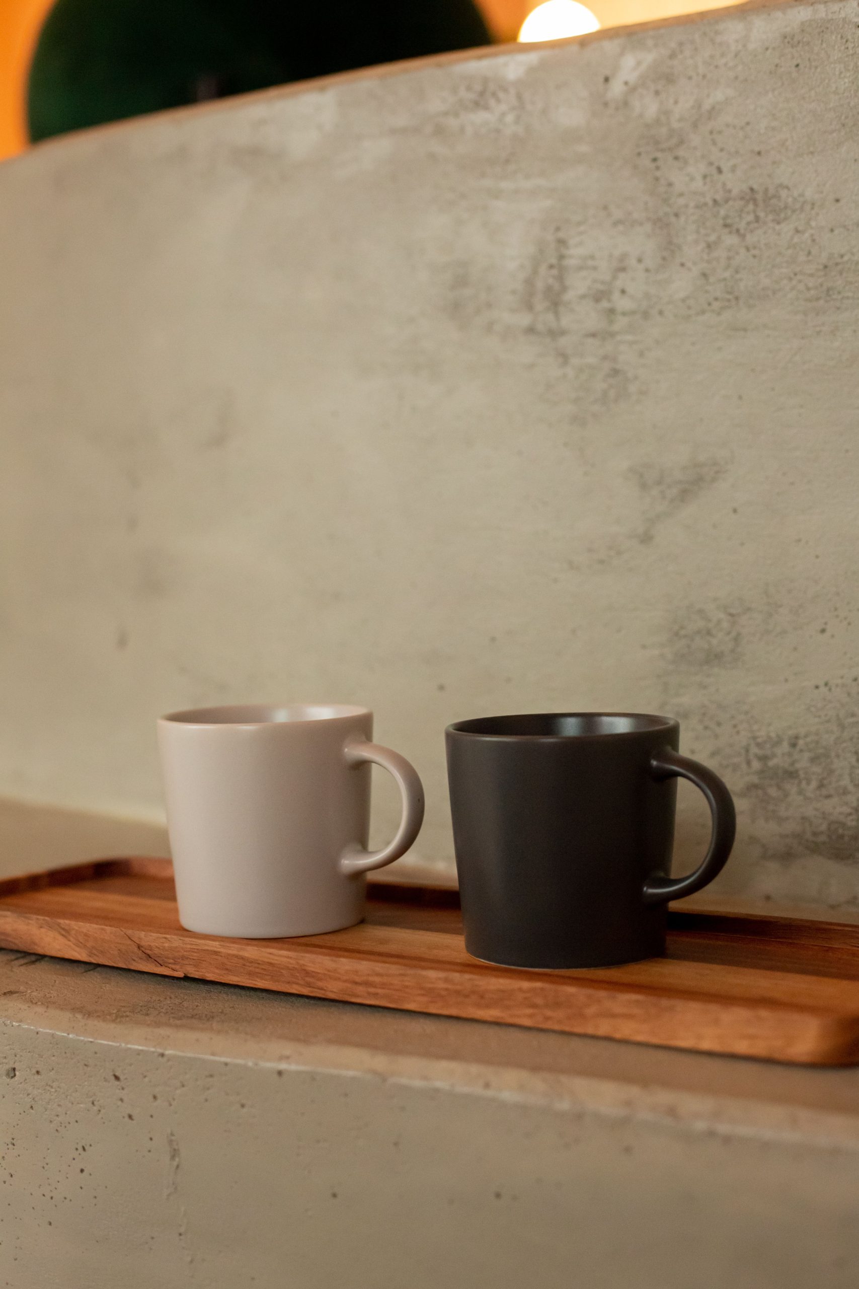
Some colors are immediately nameable. Others live in that fascinating, ambiguous territory where two worlds meet. Brüon (also spelled “bruon” in its anglicized form) is one of those rare hues — a deep, murky blend of brown and green that carries the weight of aged moss, dark forest undergrowth, and weathered timber all at once. It sits somewhere between olive, khaki, and dark umber, refusing to commit fully to any single identity.
That complexity is precisely what makes it so compelling for designers and brand builders. When you reach for brüon, you’re not choosing a simple, declarative color. You’re choosing depth, nuance, and a certain quiet confidence.
The word itself has roots in Old English and Germanic language families, where it described a rich, dark brownish tone. Historically, it appeared in manuscript descriptions and textile records to denote earthy, deeply saturated dyes derived from bark, walnut husks, and organic matter. This ancient lineage is part of what gives the color its feeling of permanence — brüon doesn’t feel trendy because, in many ways, it predates trends entirely.
In contemporary design discussions, the term has been revived as a more evocative alternative to “dark olive” or “brown-green,” especially useful when trying to communicate a specific mood rather than a precise hex value.
Color psychology tells us that greens suggest nature, growth, and calm, while browns communicate groundedness, reliability, and warmth. Brüon carries both — but in a more subdued, sophisticated register than either color achieves alone. It doesn’t shout. It settles.
The associations it tends to evoke include:
This makes brüon a particularly strong choice for brands in sectors like artisan food and drink, sustainable fashion, wellness, architecture, and publishing.
One of the most interesting challenges — and opportunities — with brüon is knowing how to pair it effectively. Because it sits at that brown-green intersection, it plays beautifully with certain palettes and can feel discordant in others.
Effective pairings include:
Avoid pairing it with bright, high-saturation colors — electric blue, vivid coral, or neon green will strip away its quiet authority and leave it looking muddy by comparison.
In typography specifically, brüon works exceptionally well as a headline or display color on light, warm backgrounds. A refined serif typeface set in brüon on a cream or off-white field feels considered and intelligent. It’s also an excellent choice for wordmarks and logotypes in sectors where trust and heritage matter — it reads as deeply serious without the coldness of a pure black.
One practical note worth flagging: brüon is a color that rewards careful calibration across media. In print, especially on uncoated paper stocks, its earthy richness tends to deepen beautifully, leaning toward the brown end of its range. On screen, depending on monitor calibration, it can shift slightly greener. Always test your specific tonal value across both contexts before locking in a brand palette.
A useful starting point in digital: look for hex values in the range of #4A4A2A to #5C5230, then adjust based on the specific balance of brown and green you need for your application.
Brüon is the kind of color that rewards designers who are willing to move beyond the familiar. It won’t win you instant attention, but it will earn something harder to come by — a feeling of considered authenticity that audiences sense even when they can’t name it.
In a visual landscape crowded with bold statements, sometimes the most powerful thing a brand can do is speak quietly, and speak well. Brüon does exactly that.