1. Artiveko Studio
  2. »
  3. Blog
  4. »
  5. Harbourger Font: The Secret to Timeless Branding

Harbourger Font: The Secret to Timeless Branding

August 23, 2026
Share :
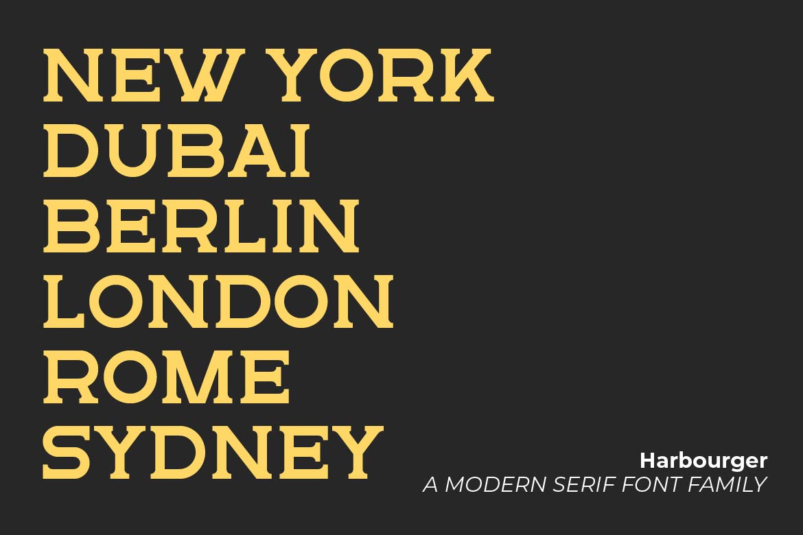
Harbourger preview 06

Harbourger Font: The Secret to Timeless Branding

In an era of fast-moving trends and aesthetic-of-the-month social media cycles, creating a brand that looks good for a decade is the ultimate challenge. Designers often get caught between choosing something too trendy (which expires in a year) or something too classic (which feels dated).

This is where the Harbourger Font enters the conversation. It was not designed to be a temporary trend; it was crafted to be a cornerstone for brands that value longevity and authority.

The Anatomy of Harbourger: Boldness Meets Balance

Harbourger is a timeless serif family that balances sharp terminals with a sturdy, reliable structure. If you have been looking for a typeface that feels as expensive as a high-end fashion house but as approachable as a modern tech startup, here is why Harbourger stands out:

  • High Contrast with High Readability: Unlike many high-contrast serifs that break down at small sizes, Harbourger maintains its integrity, making it perfect for both massive billboards and mobile app interfaces.
  • Authority Without Arrogance: The vertical stress and refined curves give the font a voice of leadership. It does not scream for attention; it commands it.
  • Versatile Weights: From a delicate Light weight for editorial layouts to a commanding Bold for luxury packaging, the family provides a complete typographic system.

How to Style Harbourger for Modern Branding

To get the most out of this typeface, consider these three professional pairing and styling tips:

  • The Minimalist Approach: Use Harbourger Bold for your primary headlines and pair it with a clean, geometric sans-serif for subheadings. This creates a balanced, professional hierarchy.
  • The Luxury Layout: Set Harbourger with generous letter spacing (tracking) in all-caps for a premium, boutique feel. This works exceptionally well for jewelry, high-end skincare, or architectural firm logos.
  • The Content-First Strategy: Because of its refined serif structure, Harbourger is an excellent choice for long-form quotes or About Us sections where you want to build trust and storytelling.

Conclusion: Building for the Future

Choosing a font like Harbourger is a strategic decision. It tells your clients and your audience that your brand is here for the long haul. It bridges the gap between the heritage of traditional typography and the sleek requirements of modern digital design.


Ready to elevate your brand? Explore the Harbourger Font Family on our Shop.

Related Post

Leave a Reply

Your email address will not be published. Required fields are marked *
Scroll to top