The Groote Font family has emerged as a favorite among designers who aren’t afraid to take up space. In a world of safe, minimalist designs, Groote stands as a testament to the power of bold, high-impact typography. This guide explores how to leverage this distinctive typeface to create layouts that are both visually stunning and functionally sound.
We are seeing a move away from the “whitespace-only” philosophy toward more expressive, “brutalist” layouts. Bold typefaces like Groote provide the structural integrity needed for these designs. They act as anchors, allowing designers to experiment with asymmetrical grids and overlapping elements without losing the core message of the piece.
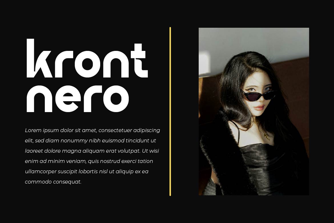
Groote isn’t meant for body text—it’s a performer built for the spotlight. It shines in editorial headers, high-fashion branding, and experimental web interfaces. When paired with a light, neutral sans-serif, Groote’s thick strokes create a dynamic tension that keeps the viewer engaged. Its unique letterforms, especially in the capital letters, offer a rhythmic quality that mimics the pulse of urban environments.
To make Groote truly pop, you need a body font that knows when to step back. Look for geometric sans-serifs with high x-heights or very clean, light-weight monospaced fonts. This contrast between the “heavyweight” Groote and the “featherweight” companion is the hallmark of modern sophisticated design.
As a display font with significant detail, it is crucial to optimize its delivery. Using WOFF2 formats and implementing variable font technology allows you to use multiple weights of Groote without bloating your site’s load time. This ensures that your bold design doesn’t come at the cost of SEO or user retention.
In summary, Groote is more than just a typeface; it’s a design strategy. When used with intention, it transforms a simple layout into a powerful visual statement that demands attention and respect.