You have the logo.
The packaging.
The tagline.
But for some reason…
your brand doesn’t stick in people’s minds.
It could be your font.
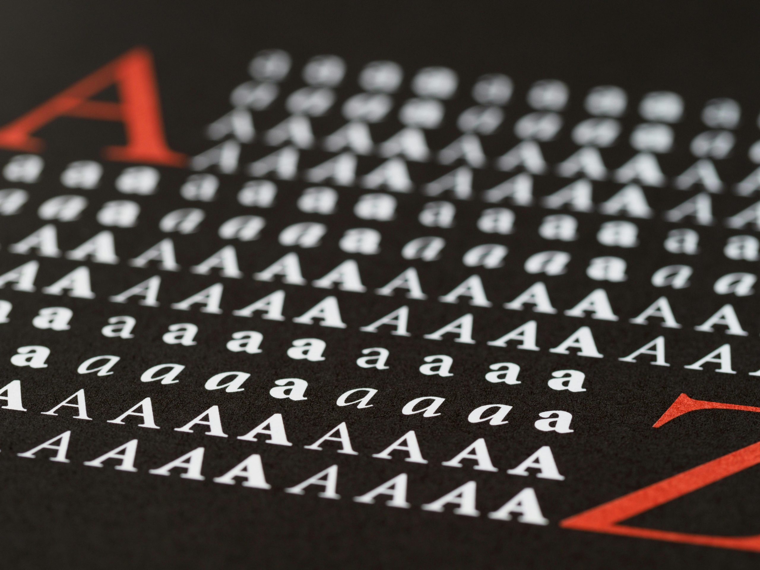
Fonts like Poppins, Roboto, or Lato are clean.
But they’re everywhere.
If everyone’s using them, your brand becomes background noise.
You’re not bad—just forgettable.
But safe ≠ smart.
Imagine 10 people saying the same sentence.
The one who says it with personality is the one you remember.
Fonts do the same thing for your brand.
They’re not just decoration.
They’re communication.
Your font should reflect the tone and soul of your brand.
Break out of the free-font bubble. Invest in original typography.
Repetition builds memory. Use your font across all platforms: website, social media, packaging, ads.
Feels premium and smart — not just “techy.”
👉 Use Ancola
Feels like luxury, not just another serif.
👉 Explore Moonclare
Built to dominate packaging and attention.
👉 See Bodda
You don’t want your product to be “just another product.”
So why use “just another font”?
Read: The Role of Typography in Building Brand Identity (Adobe Blog)
