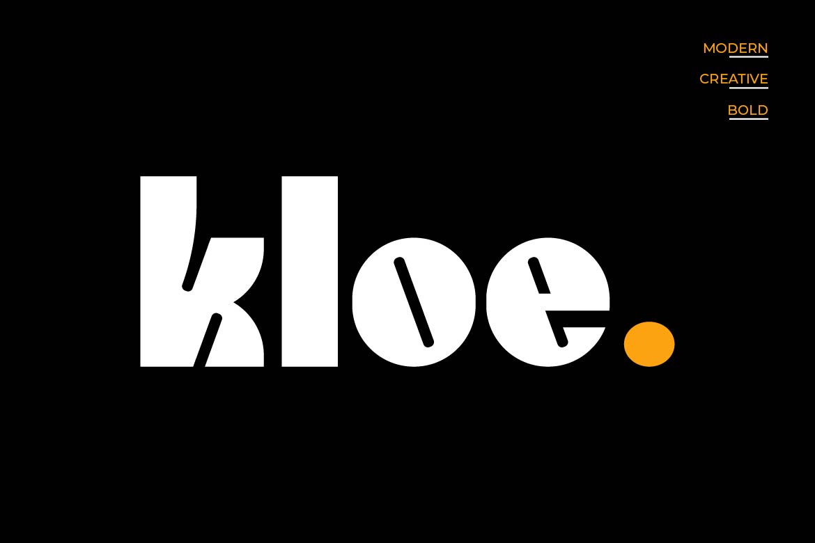
Kloe is a contemporary serif typeface that sits comfortably at the intersection of classic elegance and modern restraint. With its refined letterforms, carefully considered stroke contrast, and warm personality, it has become a go-to choice for designers working on projects that demand both sophistication and approachability. Whether you’re developing a brand identity, designing editorial layouts, or crafting packaging that needs to stand out on a shelf, Kloe brings a distinctive character that elevates the work without overpowering it.
Understanding what makes a font like Kloe work — and when to use it — can genuinely transform the quality of your design decisions. Let’s dig into the details.
Kloe’s defining quality is its balance. It carries the structural authority of traditional serif typography — think carefully modulated thick-to-thin transitions and purposeful bracketed serifs — while avoiding the stiffness that can make older serif styles feel cold or dated. The result is a typeface that feels trustworthy and refined, but also human and inviting.
This tonal balance makes Kloe particularly well-suited for brands that want to communicate:
One of the most practical questions a designer asks about any typeface is simply: where does this actually work? Kloe shines in several specific contexts.
Branding and logo design: Kloe’s letterforms hold up well at large display sizes, making it a strong candidate for wordmarks and logotypes in the beauty, wellness, and lifestyle sectors. The subtle personality in each character gives a brand identity a sense of intentionality — it doesn’t look like a default choice.
Editorial and magazine layouts: Used as a headline or subheading typeface, Kloe brings elegance to feature articles, lookbooks, and printed materials. Its readability also means it can function reasonably well in longer body text settings, particularly in print.
Packaging design: For premium products — artisan food, skincare, wine labels, candles — Kloe communicates quality at a glance. The serif structure adds gravitas, while the warmth in the design keeps things from feeling sterile.
Wedding and event stationery: Kloe is a natural fit for formal yet personal occasions. It carries the romance of classic serif typography while remaining legible across a range of print formats, from invitation cards to menus and signage.
A great serif like Kloe becomes even more powerful when paired thoughtfully. The goal in any type pairing is contrast without conflict — two typefaces that complement rather than compete.
Here are a few pairing directions worth exploring:
The key principle: let Kloe do its work. Don’t pair it with another highly expressive or decorative typeface, or the two will pull attention in different directions.
Even a beautiful typeface needs considered handling. A few practical guidelines:
The right typeface is always a function of context — your audience, your message, and the feeling you’re trying to create. Kloe is an excellent choice when your project calls for elegance with warmth, and when the brand or content needs to feel both premium and personal. It’s a typeface that respects typographic tradition while remaining thoroughly contemporary — the kind of quiet confidence that great design often demands.
If you’re building a visual identity or editorial system and Kloe is on your shortlist, it deserves serious consideration. Test it at your intended sizes, try it alongside your chosen colour palette, and see how it handles your specific content. Good typography reveals itself in use — and Kloe tends to reveal itself very well.