Before anyone reads your tagline or scrolls through your website, they already feel your brand — through typography.
Fonts aren’t just letters; they’re emotional messengers.
They whisper whether your brand is playful, bold, calm, or elite — often within seconds.
Typography, when used right, becomes your brand’s voice made visible.
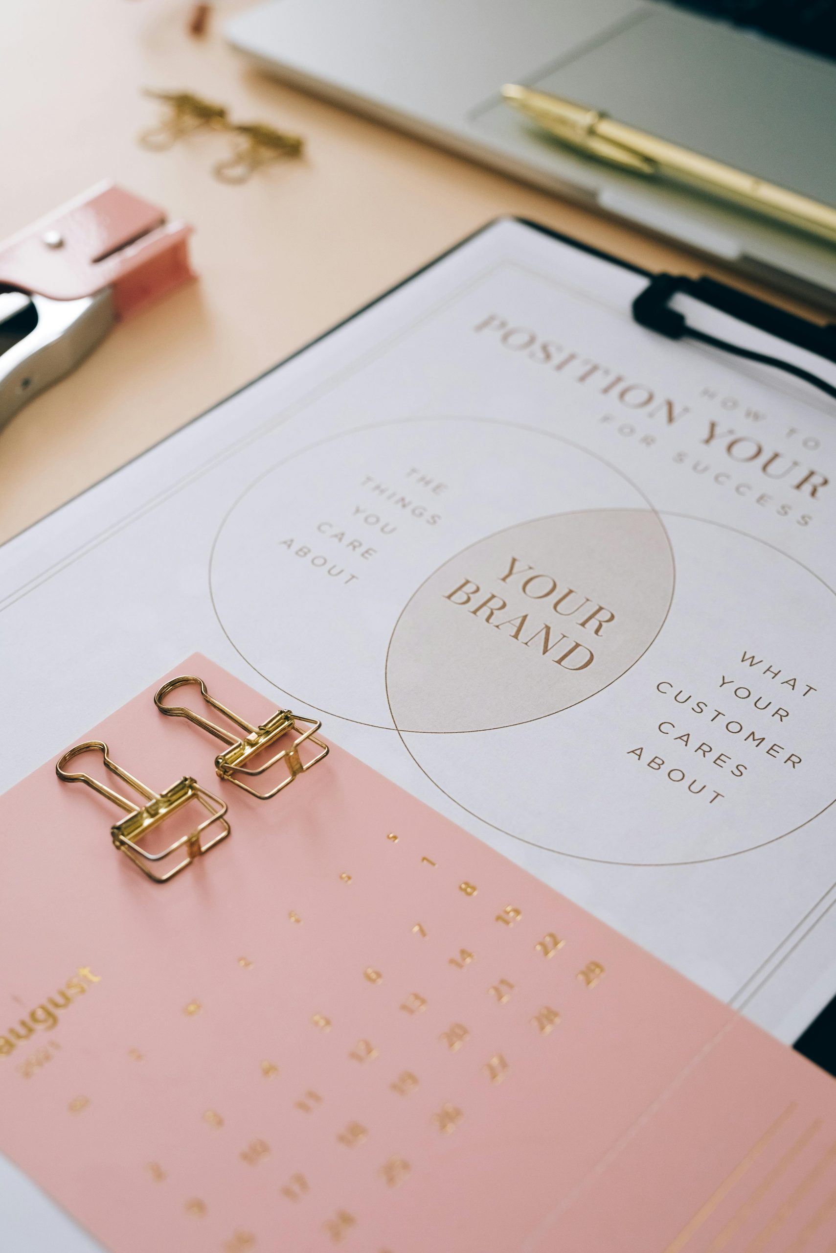
Brand personality is how your audience emotionally connects with you.
It’s the human traits your brand embodies — friendly like a barista, sharp like a strategist, or elegant like a couture designer.
Fonts help visualize those traits.
They turn abstract values (trust, innovation, joy) into something the eyes can feel.
| Brand Trait | Font Choice Example | Impression |
|---|---|---|
| Friendly | Rounded Sans-Serif | Approachable & casual |
| Confident | Bold Sans-Serif | Strong & assertive |
| Elegant | Thin Serif | Sophisticated & timeless |
| Innovative | Geometric Sans-Serif | Modern & forward-thinking |
Every brand has a tone — and every tone has a typographic counterpart.
| Brand Voice | Recommended Font Family | Artiveko Font |
|---|---|---|
| Minimalist Modern | Geometric Sans | Ronta |
| Luxury Timeless | High-Contrast Serif | Vatamora |
| Playful & Creative | Rounded Display Typeface | Hemmo |
| Professional & Clean | Humanist Sans | Rogoro |
💬 Pro Tip: Avoid using too many font families. Stick with one main typeface and one accent font for personality balance.
Typography affects perception subconsciously.
Here’s how:
When used strategically, typography becomes your silent ambassador.
Consistency is what turns fonts into identity.
Here’s how to implement typography systematically:
Your typography should evolve with your brand but never lose its DNA.
Looking for fonts that translate emotion into identity?
Here are Artiveko’s best picks:
Each typeface was crafted to balance emotion, precision, and memorability.
Your brand deserves typography that feels like you.
Discover Artiveko’s collection of fonts designed for storytelling, trust, and emotional impact.
👉 Explore Artiveko Fonts That Define Brand Personality
