Color is one of the fastest ways to communicate a brand message—faster than logos, fonts, or even words. Research shows that color affects mood, trust, and purchase decisions within milliseconds. That’s why brands rely heavily on color psychology to establish emotional impact.
Let’s explore how color shapes perception and influences your audience.
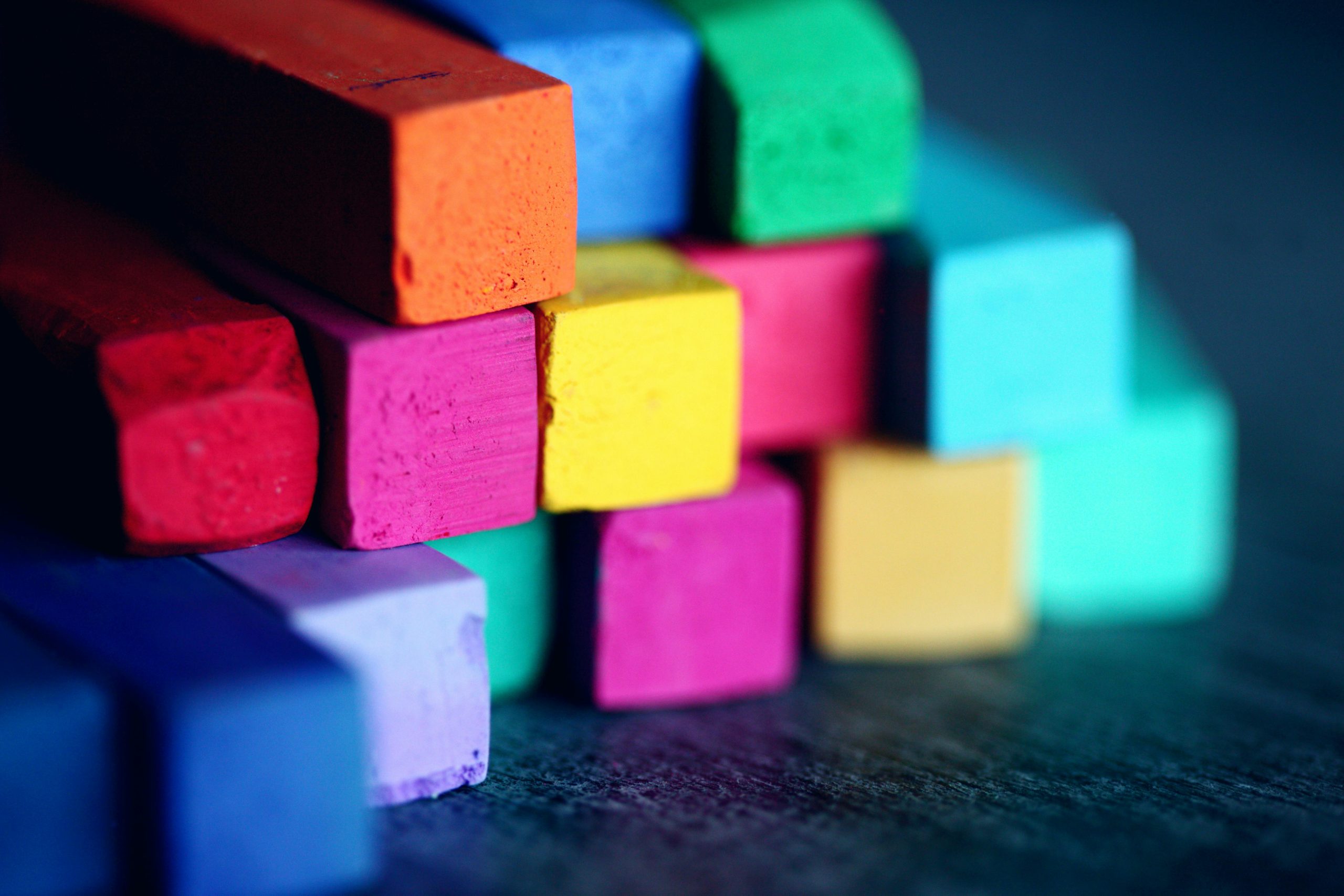
Colors carry emotional meaning. Before customers process the message, they feel the message.
For example:
This automatic reaction makes color psychology one of the strongest tools in brand identity design.
Calm, trustworthy, secure.
Used widely by finance, tech, and corporate brands.
Energetic, bold, attention-grabbing.
Perfect for sales-driven or high-intensity brands.
Optimistic, youthful, creative.
Ideal for playful and friendly identities.
Natural, balanced, sustainable.
Great for eco-friendly or wellness brands.
Timeless, modern, premium.
Often used in luxury identity systems.
Color psychology works because humans form emotional associations at a subconscious level.
Color directly affects:
Brands that align color psychology with their message tend to outperform competitors visually and emotionally.
Not all color choices work for every brand. A clear strategy is needed:
A well-chosen palette communicates identity without saying a word.
To use color psychology effectively, designers often combine strategic palettes with high-quality fonts and layout systems. Premium fonts like those from Artiveko enhance how color interacts with typography:
Color + typography = powerful brand storytelling.
