Your brand looks decent.
Your content works.
But deep down, you know…
something feels off.
Let’s be honest:
It might be your font.
No… just no. Unless you’re running a 2007 school fair.
Way too overused. Used to feel playful—now just feels dated.
This one’s a meme. Avatar used it. That’s it. Retire it.
Stop shouting at your audience. Let the design speak.
They often lack proper kerning, licensing, and polish.
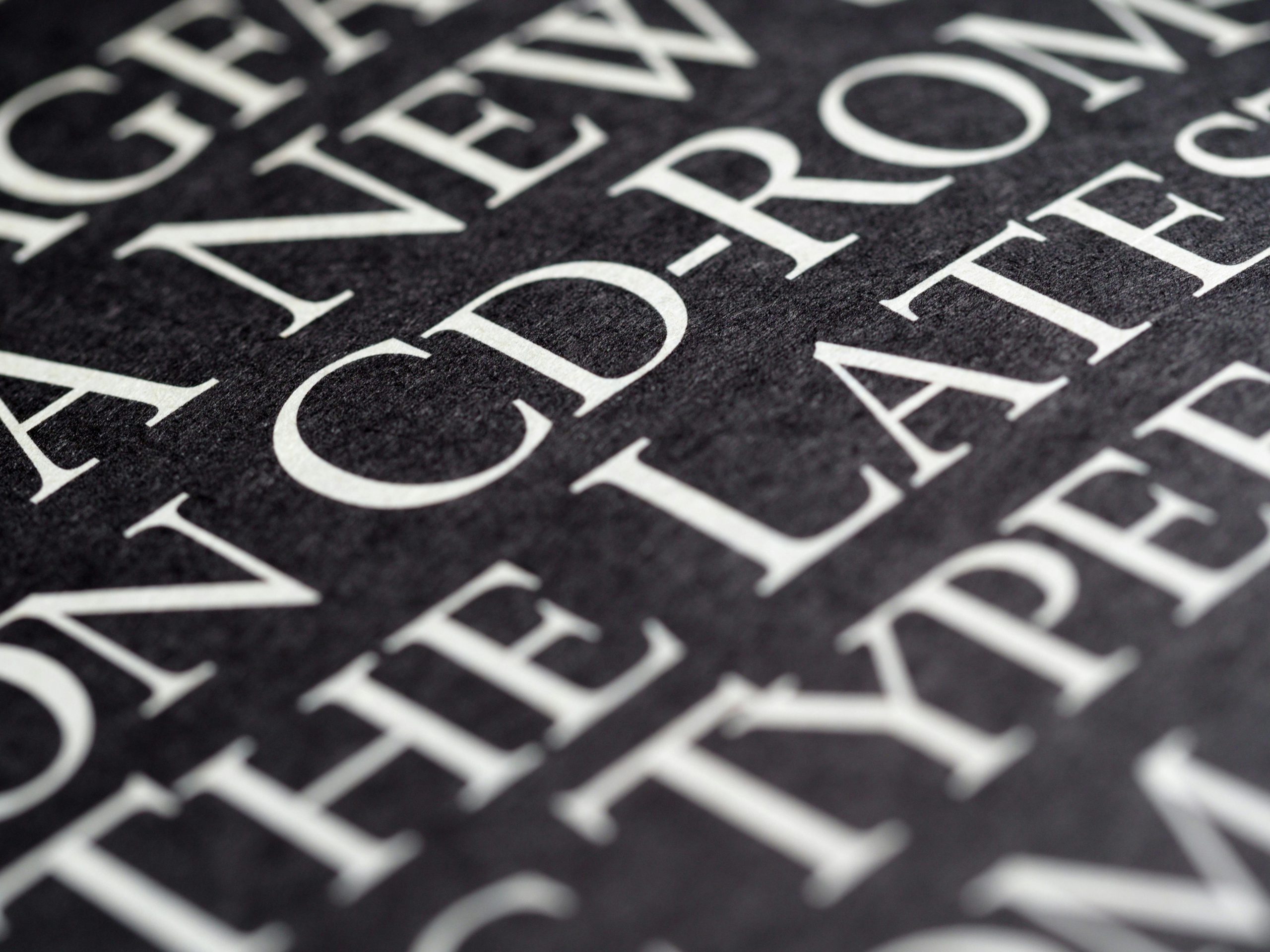
Fonts communicate tone, trust, and professionalism.
When you use low-effort fonts, people assume it’s a low-effort brand.
Even subconsciously.
Your font should:
You wouldn’t pitch to investors in pajamas.
Don’t pitch your brand in lazy typography.
Read : Upload custom fonts to an organization
Elegant serif. Modern luxury vibes.
Perfect for: Beauty, skincare, lifestyle brands
👉 Explore Ethical Mature
Loud, clean, and confident.
Perfect for: Bold packaging, beverages, promos
👉 Use Nomoda
Smart, professional, modern sans.
Perfect for: Digital brands, tech, startup kits
👉 Try Codda
✔ Your design feels more intentional
✔ Your brand looks more valuable
✔ People feel your message faster
✔ You’re taken seriously

%20by%20Artiveko%20Studio)